
Project Timekeeper
Introduction
-
I spent 6 weeks researching and prototyping widget designs which would remind students and faculty to track their working hours on the IU Mobile app.
-
Design system
Journey mapping
Semi-structured interviews
Visual design
-
Alan Milner (Project Leader)
Cody Thompson (Design Lead)
Paco Wong (UX Designer)
Design Problem
For my capstone project, I partnered with the design team at University Information Technology Services (UITS).
UITS was integrating Kuali Time into the native IU Mobile app so that users could easily access this vital feature.
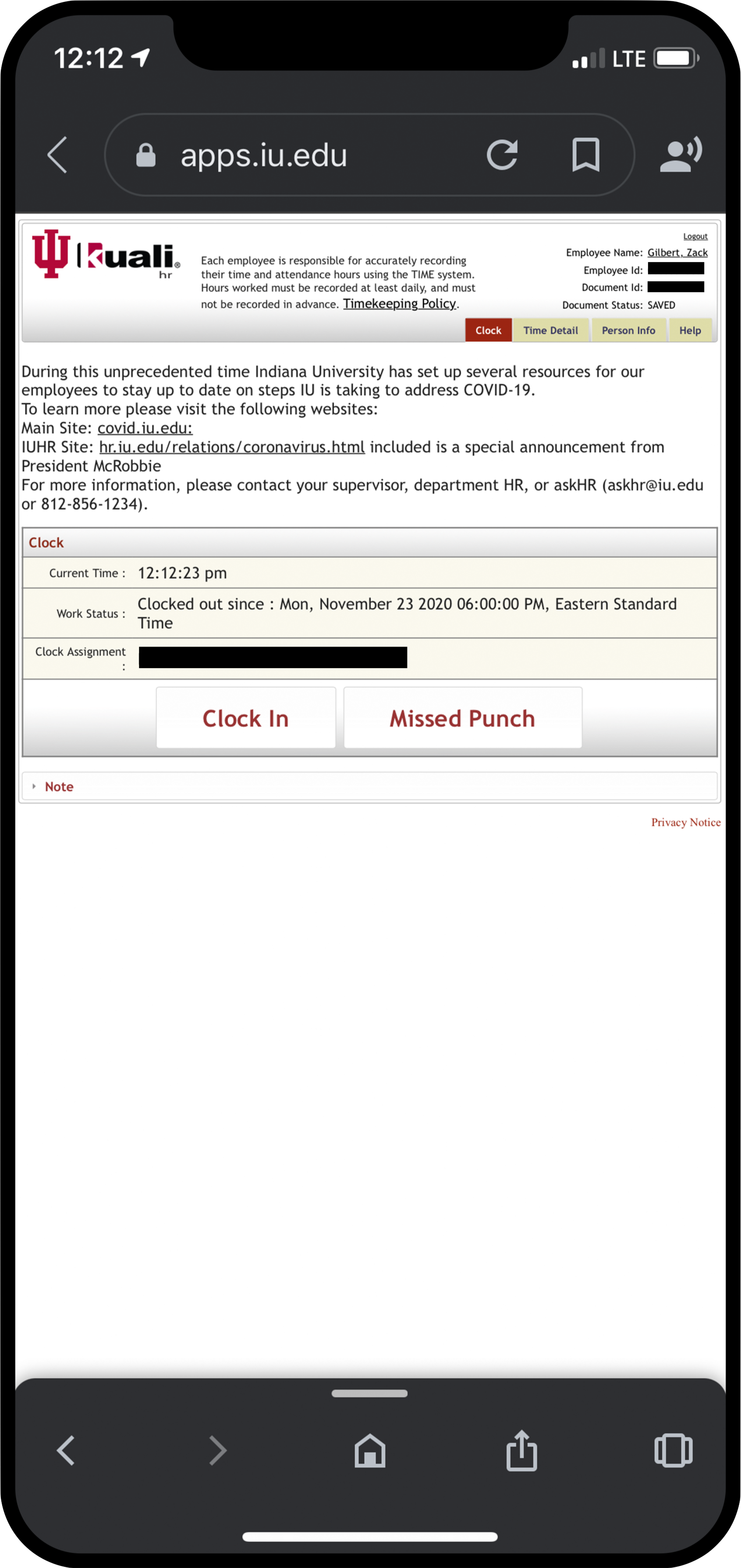
Kuali Time was a separate, online application employees at Indiana University used to keep track of their working hours. The image on the right shows what it looks like on a mobile device.
Unfortunately, each week hundreds of students and faculty would forget to log in or out of the application. Administrators were wasting a lot of effort fixing the wrong times, which was a significant cost to the university. This was also an annoyance to the users who had to report their “missed punches.”
My task was to design a widget that would remind university employees to record their hours more timely and accurately.
User Research
First, I conducted user research to determine what information would be the most valuable to display as a widget. The Project Leader Alan suggested I also learn how employees switch between multiple job assignments.
Semi-structured Interviews
I led interviews with employees at IU Recreational Sports who had multiple assignments. I asked several open-ended questions to identify challenges with using Kuali Time.
I learned valuable insights about the timekeeping process:
Employees have to clock in each time they start a new assignment.
Employees are penalized for not clocking in. However, clocking in is an annoying and time-consuming process which takes several steps.
The name Kuali Time is difficult to spell or remember when looking it up.
Clocking out can be very easy to forget at the end of a long shift, even if not using a digital system.
User Persona and User Journey
After completing the interviews, I organized the information into a user persona and a journey map. This helped me identify opportunities where design widgets could be impactful.
The three stars correspond to three opportunities for widgets to provide benefits to the user:
Widgets could immediately access Kuali Time without having to look it up.
Widgets could help employees switch assignments more easily.
Widgets could show a visual reminder to clock out at the end of a shift.

My user persona and journey map represents the people I interviewed.
Initial Prototype
Next, I designed widgets based on the employees’ need to have clear visual cues showing when they are clocked in or out of Kuali Time.

Design Feedback
Three other teammates were also doing their capstone projects with UITS. I asked them for feedback on my initial prototypes.
They said this was a good start, but I needed to use a consistent design style. These designs mixed together gradients, shading, and a flat style which could be confusing to users.
The UITS designers also gave me some quick tips I should consider when creating widgets.
They suggested that I use the system font for iOS 14 called SF Pro, don’t go below a text size of 12px, and make larger-sized widgets to display more information.
First Iteration
Then, I applied the feedback from my classmates and UITS designers by adding a more consistent style and using iOS 14 system fonts.
Design Feedback
I presented my progress in front of my classmates and received useful feedback on my prototypes.
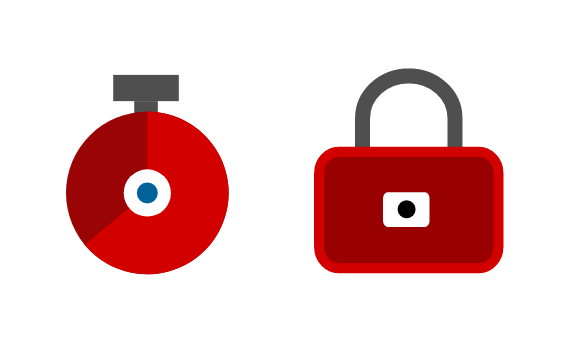
The icons were not clear. One person thought it looked like a loading icon and didn’t understand what the lock represented.
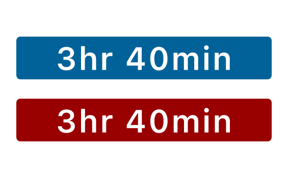
The blue and red backgrounds confused people into thinking they were buttons.
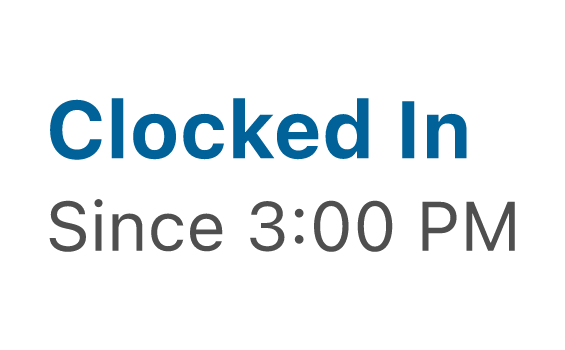
The text was not consistently aligned and lacked contrast. For instance, the ‘Clocked In’ status should be more noticeable.
Second Iteration
After that, I again applied my classmates’ feedback by using a simpler icon system, removing the button look, and increasing the text contrast and alignment. I also added different-colored backgrounds as a strong visual cue for different states.
Accessibility Review
Accessibility was a priority for UITS. By adding the vivid background colors, I made the visual cues more apparent. However, the UITS team pointed out the lack of color contrast (such as the turquoise against the blue background) could be an issue for colorblind and other visually impaired users.
My teammate Jeena recommended I use a color contrast accessibility validation tool to check if my designs complied with accessibility regulations.

The blue colors didn’t pass WCAG 2.1 guidelines for color contrast.
While the colors were aesthetically interesting, they contradicted with the Rivet Design System for Indiana University’s digital interfaces. The UITS team suggested I try a grey background because it is more consistent with the Rivet Design System experience and it is more accessible to users.
Design Feedback
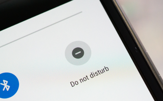
One of my friends pointed out that the “Clocked Out” icon could be confused with the “Do not disturb” function on Android devices.
The UITS team advised me to identify touch target areas. Small widgets act as a single target, but larger sizes can have multiple touch targets.
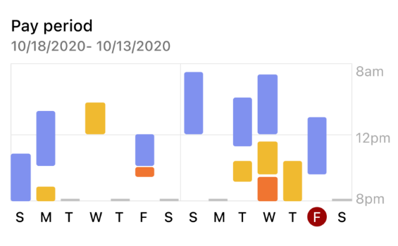
I needed to redesign my time detail chart to show when assignments happened. This illustration by my teammate Nan gave me inspiration.
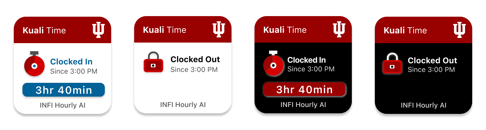
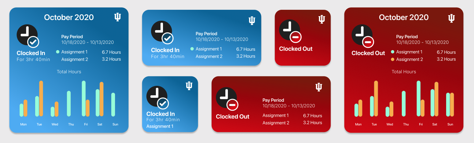
Design Solution
Lastly, I handed off my final design solution to the UITS design team. These mock-ups were consistent with the design system and passed accessibility standards.

These are the main samples of my final design. The entire package included a full set of design mock-ups for each size along with designated touch target areas.
Reflection
As my first time creating a visual design for a client, I found this to be a rewarding experience.

I am extremely thankful and proud of my growth in visual design. Moving forward, I feel more confident in my ability to use prototyping tools effectively. As shown in this case study, I learned how to apply feedback and user research to support my design decisions.
I wrote a blog post which reflects on my growth in visual design throughout this project.
Click on the image to view my blog post.
Meeting with a developer made me realize that design is dependent on which information and data are available. He showed me the limits to what I could design, but I also learned what would be possible.
I am thankful for the mentorship provided by my stakeholders. One of the main reasons I decided to do an external project is because I wanted to challenge myself to work within design constraints. As my designs were critiqued, I learned how to support my design decisions, design for accessibility, work within data limitations, and follow standard rules for Apple iOS 14.
It has also been so helpful having supportive UITS teammates who gave me reliable and constructive feedback on my design concepts.